A project I currently work on has a lot of different and sometimes non-trivial layouts. And it can be a struggle to get all the different elements sized correctly to avoid overflows and extra scrollbars. So I have deep dive into the CSS specification to learn about sizing and layout models as much as possible. And how to handle issues like this better in the future. I will share my findings with you.
We will cover those topics:
- How percentage works for the height property
- Two ways how to handle stretching in Flexbox
- What
1frreally means to the browser
How does height: 100%; work
Permalink to “How does height: 100%; work” Sometimes you need to set the fixed height of some element. You can use absolute units like px, or relative units like em or rem. Those work much better in the responsive design. There is not much to talk about. You set the height to some exact number and it just works. But, when you want to use a percentage, that’s when you can encounter some trouble.
A common mistake is that people set height to 100% and think it will stretch the entire height of the parent element. But that is not always the case. Here is what the specification says about this:
The percentage is calculated with respect to the height of the generated box’s containing block. If the height of the containing block is not specified explicitly (i.e., it depends on content height), and this element is not absolutely positioned, the value computes to ‘auto’.
To translate it into simple English. If the browser doesn’t know the height of a parent it can’t calculate the height of the element (you can’t calculate percentage from unknown value). In such a case it will let the content control the height instead. This often means that you have to set height across many parent nodes (eventually up to the html element itself). That can lead to fragile layouts, where one change in the markup will break the whole damn thing.
One cool trick to avoid this problem is the usage of CSS Grid. When you set the height of the grid item’s child using percentage it will work. For the purpose of calculating height, a grid item is considered to have explicit height. This works even for grid sizing keywords like auto, max-content, and min-content. You can see it working in the codepen below.
See the Pen Set column height with percentage in grid items by Tomas Pustelnik (@Pustelto) on CodePen.
In the codepen below, you can explore how is the height with the percentage units affected by different properties.
See the Pen How height in percentage works by Tomas Pustelnik (@Pustelto) on CodePen.
If you want to know how exactly percentage units work in different properties, definitely check the amazing article from Amelia Wattenberger.
How sizing in Flexbox works
Permalink to “How sizing in Flexbox works”Flexbox is a powerful layout module, solving a lot of common layout and alignment issues easily. But, if you have been using Flexbox for some time, you have probably encountered a situation where the flex items didn’t size exactly as you expect. Flexbox works great when you don’t care so much about the size of the items. But it can get a little tricky when you need exact sizes.
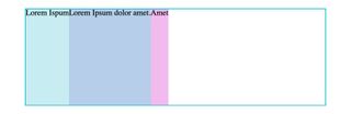
To explain how Flexbox really works we will use a simple example. We have a flex container with 3 items of different widths. If we set only display: flex on parent it will look like on the image below.
In Flexbox, flex-grow and flex-shrink properties control the shrinking and the expansion of the flex items. Those properties can be also set by shorthand flex property. The default value for the browsers is flex: 0 1 auto. This means that items can shrink if there is not enough space, but they will not expand to fill the container.

When you add flex-grow: 1 to flex items, they will stretch to fill the entire width of the container. But the items don’t have the same size. Even though they can easily fit into the container and all of them have the same value of flex-grow property. Also, the right part is a bit smaller than the left part.
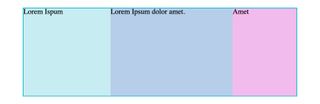
How is that possible? Shouldn’t all items have the same width? No, because Flexbox by default distributes the remaining empty space (hatched area in the image below). Not the entire container width, as some developers often think. Even if you set the same flex-grow value to all flex items, they will not have equal widths. Unless their basic width is the same as well (set via width or flex-basis properties).
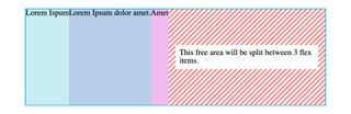
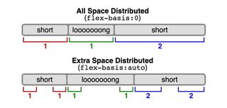
To avoid this way of space distribution you can set the flex-basis value to 0. When the flex-basis is set to any value other than auto, the width property of the items is ignored and browses will consider that all items have basic width equal to the given flex-basis. So when you set flex-basis: 0 you are telling the browser that all flex items have zero width. Thus the entire flex container width will be used as a free space to distribute based on values of flex-grow.
You can see on the schema below how flex-basis 0 and auto work exactly (image is taken from the specification).
Beware of the extra padding and border
Permalink to “Beware of the extra padding and border”One more thing to be aware of is that borders and padding on child items will increase the item’s width. And the flex items will not honor the flex-grow ratio precisely (even with flex-basis: 0). Here is a related part of the specification:
The hypothetical main size is the item’s flex base size clamped according to its used min and max main sizes (and flooring the content box size at zero).
Add padding or border to the child of flex item to fix this. As seen in the codepen below.
See the Pen Flexbox sizing by Tomas Pustelnik (@Pustelto) on CodePen.
Large grid items breaking from the grid layout
Permalink to “Large grid items breaking from the grid layout”Imagine you have two columns layout. Sidebar with header and footer and a large list of items we want to scroll. And then the main area where we display the detail of the selected item. This layout can be usually seen in an email client. We have set the fixed height of the grid. After all, we don’t want to scroll the page itself, but the items in the sidebar or the detail in the content area. grid-template-rows is set to 1fr to fill all available space.
You can see the layout in codepen below.
See the Pen how the sizing of fr units works by Tomas Pustelnik (@Pustelto) on CodePen.
But for some reason items in the sidebar are overflowing out of the grid area and the entire page is scrollable. Not exactly what we want or expect.
The problem is in the grid-template-rows property. When we set its size using the fr unit, grid items min-size is set to auto by default (according to specification). With value auto grid item will resize to fit in all the content, even it is bigger than the defined grid cell.
So grid-template-rows: 1fr; is equal to grid-template-rows: minmax(auto, 1fr);.
To fix this problem let’s change out the definition of grid rows to grid-template-rows: minmax(0, 1fr);. With this, our extra-large ul list will shrink to fit the grid defined area as we would expect. You can test it in the codepen mentioned above.
Summary
Permalink to “Summary”And that’s it. We have covered a few cases where the sizing doesn’t behave as we could expect at first. Hopefully, this article will help you to build layouts in CSS more easily and with less frustration.
